

- Industry
- Higher education
- Location
- St. Louis, MO
- Team size
- University, St. Louis's only HBCU
- What we did
- Journey review, UX concept, leadership walkthroughs
- Timeline
- Self-initiated, Nov 2025
Where they started
The site already had what a prospective student needed: admissions contacts, Apply and Visit links, programs, costs and campus stats. What it didn't have was a clear way in. A first-time visitor met many paths at once and had to work out the next step alone. The question we kept coming back to was simple: where should I start?

Where people were slipping away
We walked the path their future students take, one stop at a time.
- Hear about them
- Look them upSlip point: First-time visitors landed on many entry points at once.
- Try to understandSlip point: Programs, costs and visit details were all there, but visitors had to piece them together.
- Look for a next stepSlip point: Apply and Visit links existed, but not as a guided path.
- Reach out
- Follow up
What we changed
Three fixes, in the order that mattered most.
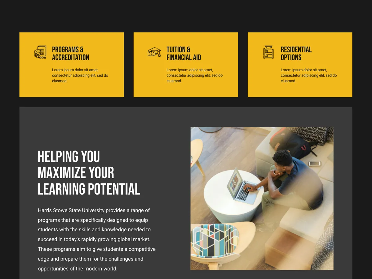
What we saw: There was no starting point based on who was visiting or what they came to do.
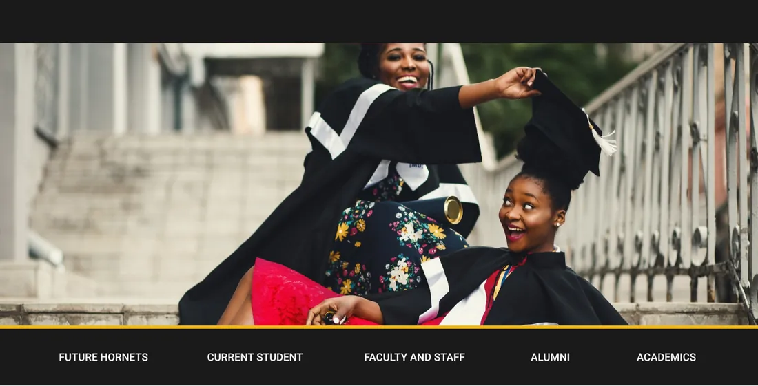
What we did: Right under a clear Schedule a Tour button, a bar sorts visitors by who they are. Future students then get three front doors to what they ask first: programs, tuition and financial aid, and where they'll live.
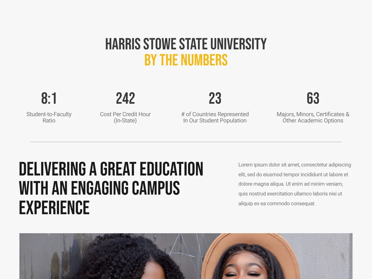
What we saw: The proof that helps a family decide showed up late, or not at all.
What we did: We put the mission up front to build trust, then placed the university's numbers right where visitors decide: student to faculty ratio, cost per credit hour, countries represented and programs offered.
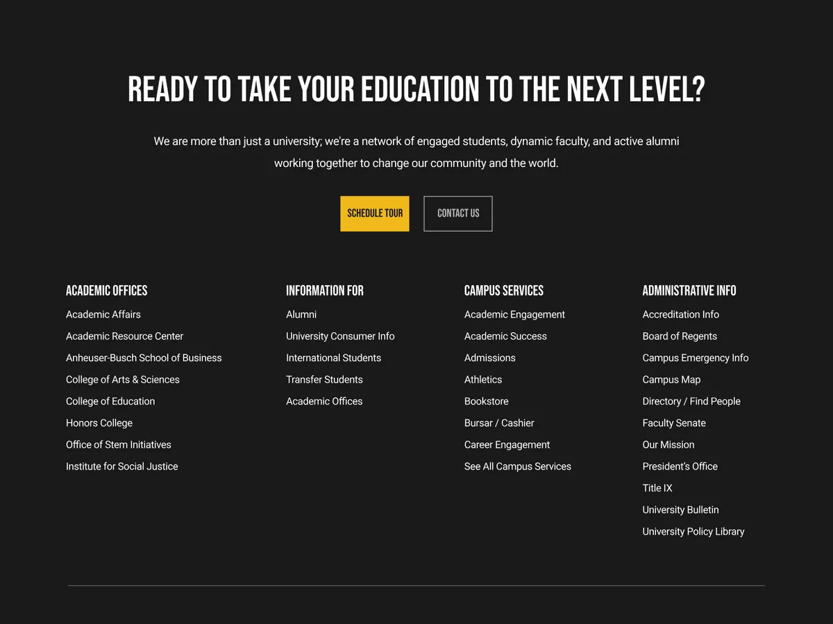
What we saw: The next step disappeared as visitors scrolled.
What we did: Schedule a Tour comes back at each decision point, and the page ends on a clear invitation and an organized footer instead of a dead end.
The result
We built it for the love of the problem. The university saw it, invited us to walk several of its leaders through it, and opened an RFP for a new web experience.
- Paths on the first screen, by who's visiting
- 5
- Front doors for programs, cost and housing
- 3
- University RFP the concept helped start
- 1
In their words
“The site experience is exceptional. It would definitely give current and future HSSU students a clear path toward their goals.”
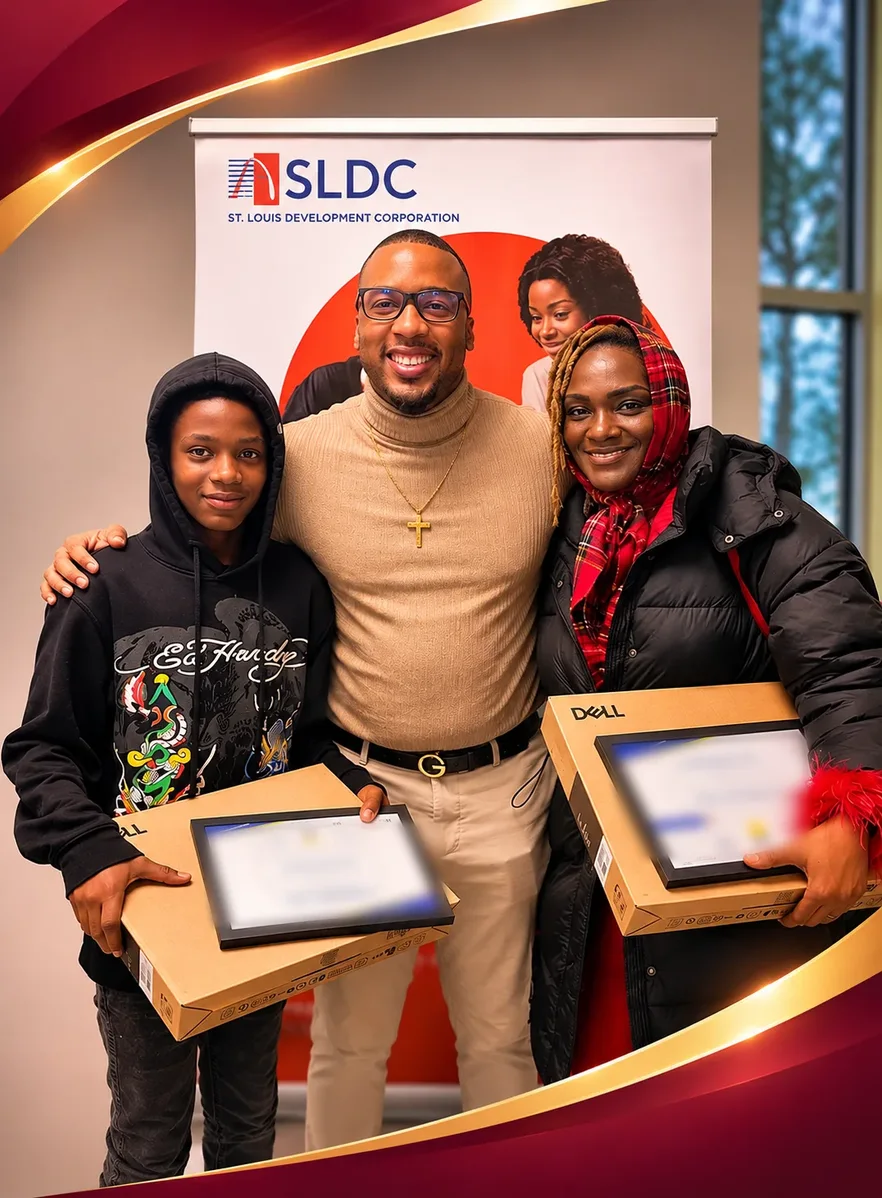
Learn 2 Tech
A city digital literacy program that could finally show what changed.
Programs like this usually report attendance. We designed Learn 2 Tech as a guided journey with four measurement points, so the City could see confidence grow skill by skill.
- Learners who started the program
- 291
- Session check-ins
- 915
- Average confidence at exit, out of 5
- 4.68
Sound like your business?
